University of California
University of California
University of California
Website redesign for
the University of California.
Website redesign for the University of California.
Website redesign for the University of California.

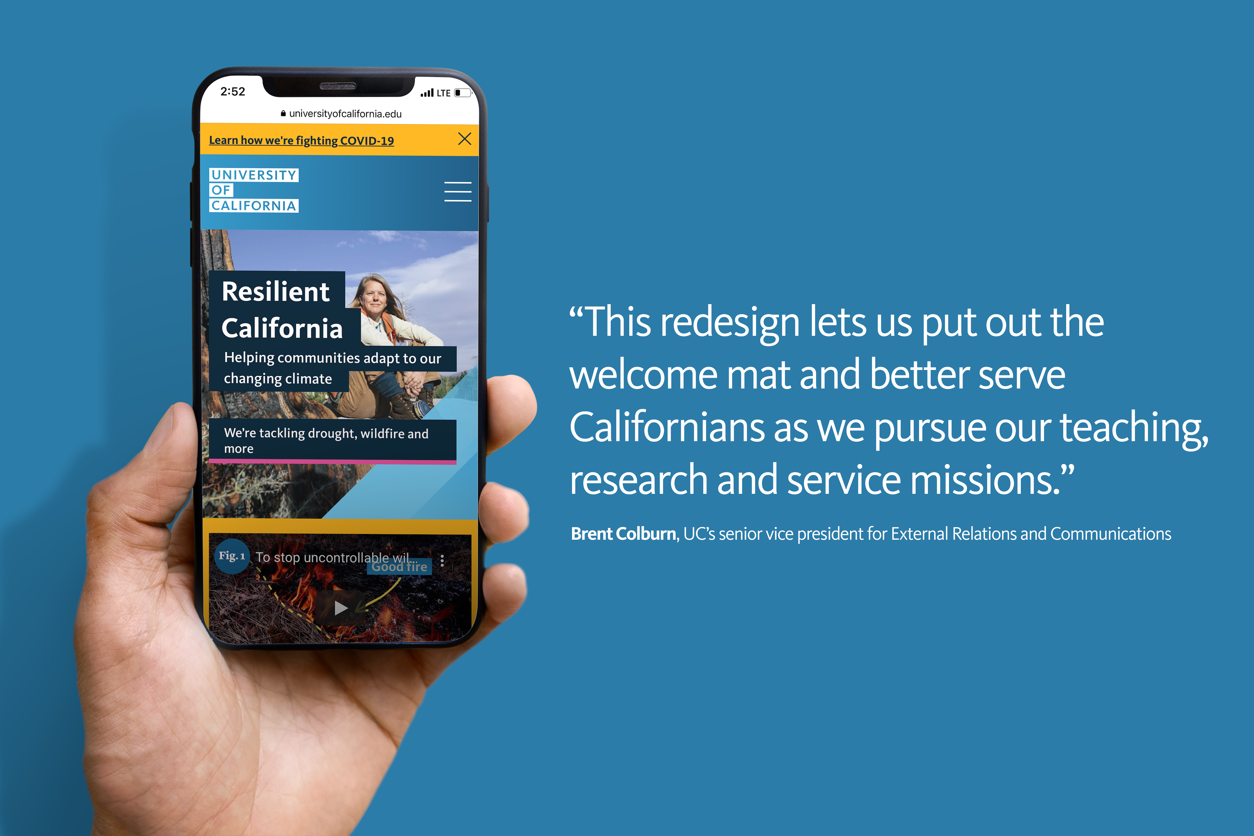
The University of California is the world's leading public research university system. With 10 campuses, five medical centers, three national labs, and a research enterprise that produces five new inventions a day, it can be hard to grasp the full impact that UC has on California and the world. Today, the UC system has more than 280,000 students and 227,000 faculty and staff, with 2.0 million alumni living and working around the world. UC came to Tank Design with the goal of redesigning their entire website—an undertaking that required a full UX overhaul, brand study, and content strategy for hundreds of webpages.
The University of California is the world's leading public research university system. With 10 campuses, five medical centers, three national labs, and a research enterprise that produces five new inventions a day, it can be hard to grasp the full impact that UC has on California and the world. Today, the UC system has more than 280,000 students and 227,000 faculty and staff, with 2.0 million alumni living and working around the world. UC came to Tank Design with the goal of redesigning their entire website—an undertaking that required a full UX overhaul, brand study, and content strategy for hundreds of webpages.

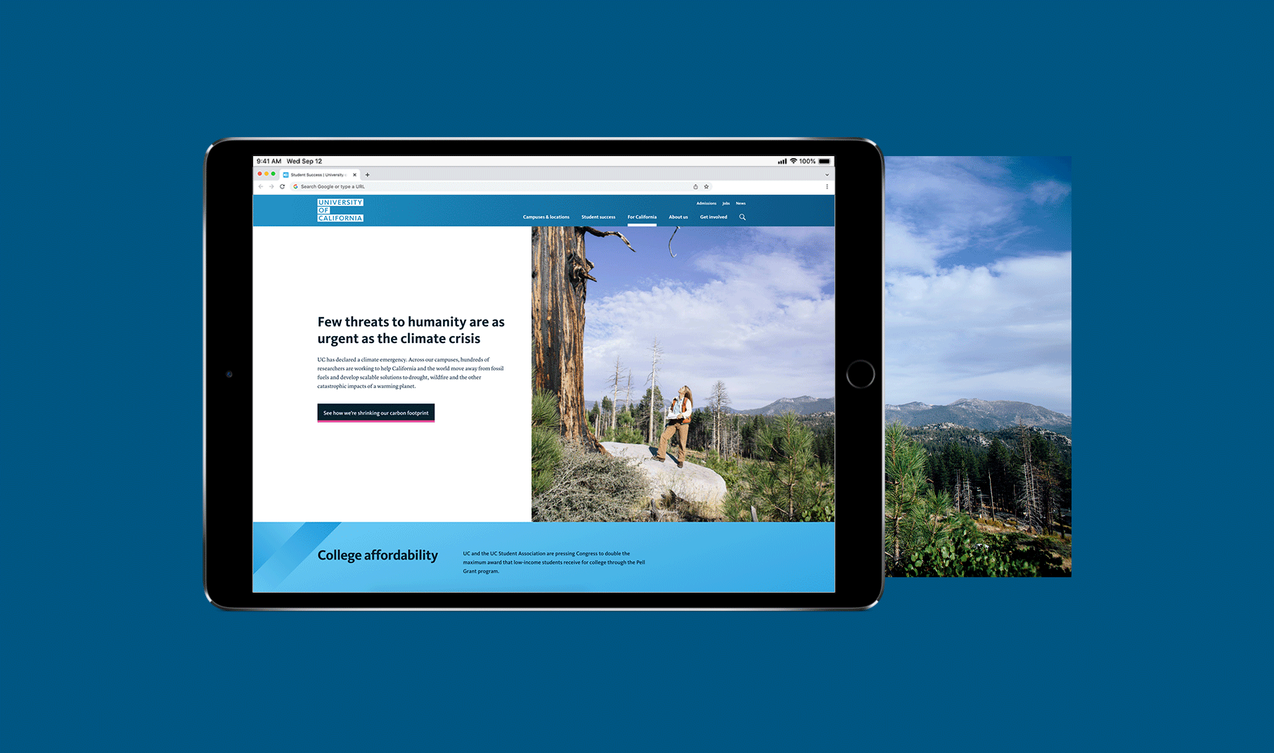
User research revealed that the existing UC site was both overwhelming and failed to meet user needs; many people struggled to navigate the site or find the information they were seeking. From this research, three major categories of users became apparent: students interested in applying to one of the campuses, community members wanting to learn more about UC's work, and alumni looking to reconnect with their alma mater. Along with a general content restructuring, three new sections were created to meet user needs:
User research revealed that the existing UC site was both overwhelming and failed to meet user needs; many people struggled to navigate the site or find the information they were seeking. From this research, three major categories of users became apparent: students interested in applying to one of the campuses, community members wanting to learn more about UC's work, and alumni looking to reconnect with their alma mater. Along with a general content restructuring, three new sections were created to meet user needs:
- A student success section that provides information on the financial, academic and social support that UC provides students from all backgrounds, including first-generation college students, student veterans, undocumented students and more.
- For California highlights the impact of UC activities on the state, from advancing solutions to climate change to conducting more than 4,000 clinical trials a year.
- The About us section makes it easy to find performance metrics on key topics like California student enrollment, graduation rates and alumni earnings.
You look great today. Want to make something exciting together? Let's chit chat.
You look great today. Want to make something exciting together? Let's chit chat.
You look great today. Want to make something exciting together? Let's chit chat.
You look great today. Want to make something exciting together?
Let's chit chat.
You look great today. Want to make something exciting together? Let's chit chat.
