
Asante
Capital Group
Asante Capital Group
Asante Capital Group
Branding for leading, independent global advisory, Asante Capital Group.
Branding for leading, independent global advisory, Asante Capital Group.
Branding for leading, independent global advisory, Asante Capital Group.
Branding for leading, independent global advisory, Asante Capital Group.
Branding for leading, independent global advisory, Asante Capital Group.
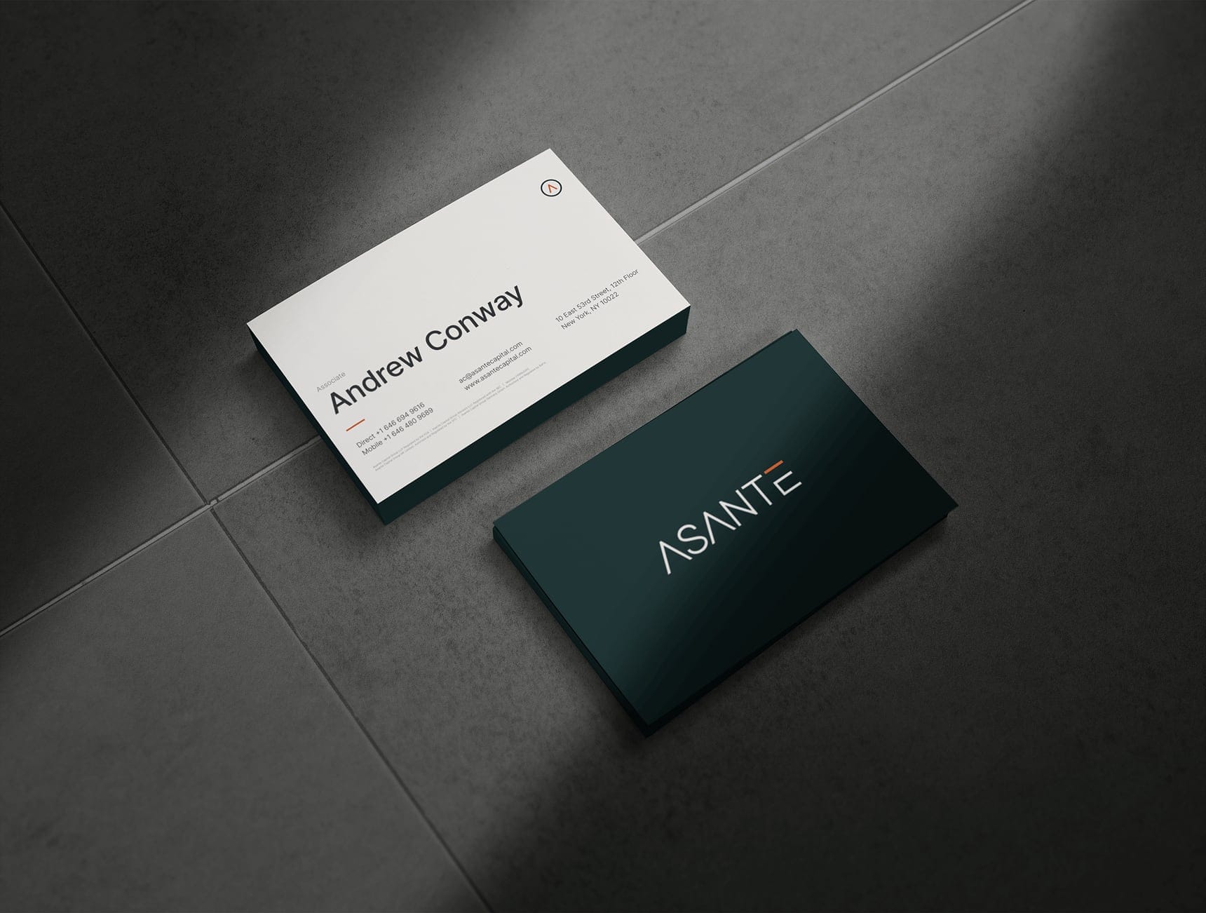
Asante is a leading, independent global advisory and private markets placement firm. As the firm continues to grow, they were looking for a refreshed brand that exemplified their commitment to providing the highest level of service to clients across the globe. The new visual language guides both Asante and their partners towards a bright, successful future.
Asante is a leading, independent global advisory and private markets placement firm. As the firm continues to grow, they were looking for a refreshed brand that exemplified their commitment to providing the highest level of service to clients across the globe. The new visual language guides both Asante and their partners towards a bright, successful future.
Asante is a leading, independent global advisory and private markets placement firm. As the firm continues to grow, they were looking for a refreshed brand that exemplified their commitment to providing the highest level of service to clients across the globe. The new visual language guides both Asante and their partners towards a bright, successful future.
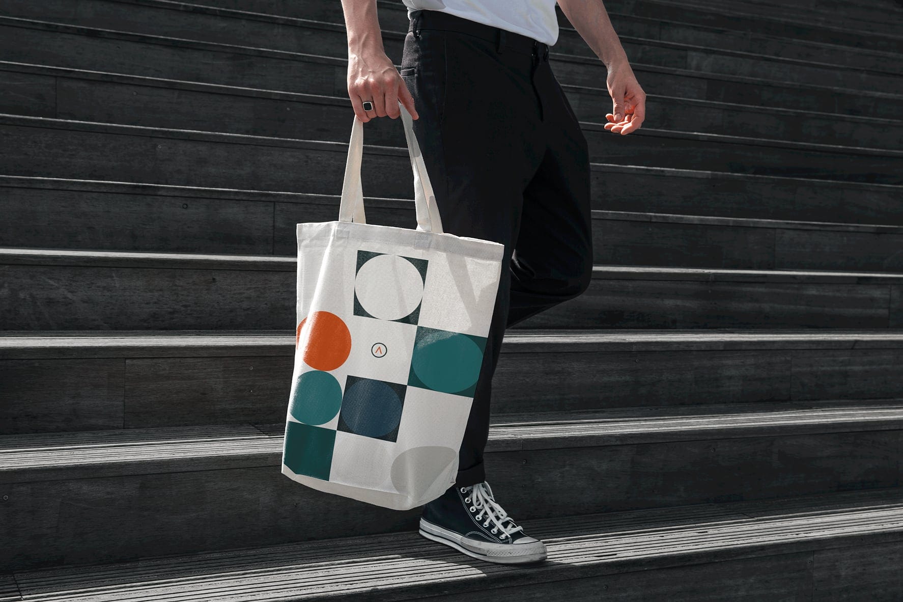
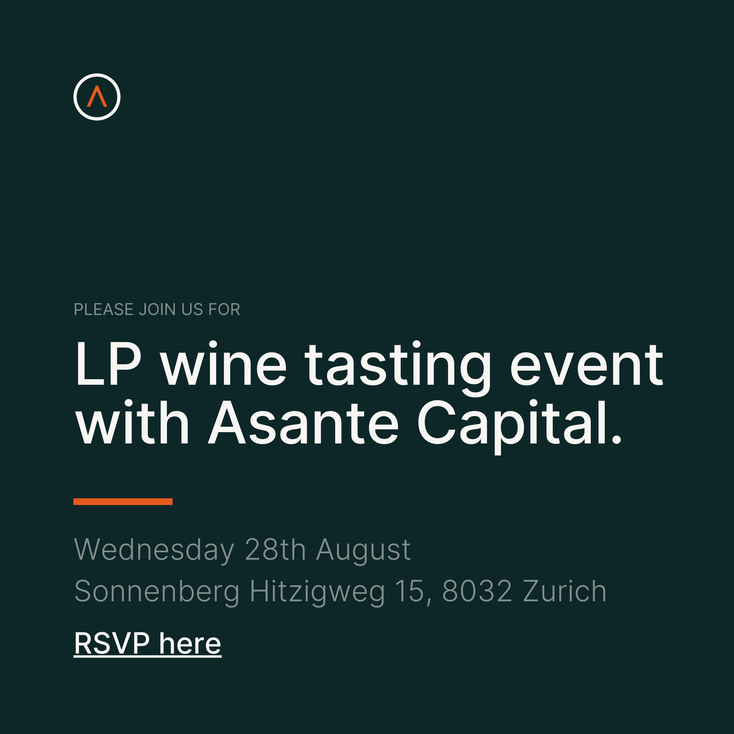
Rooted in the founding partner’s sailing background, the refreshed brand illustrates the strength and guidance Asante provides their partners in navigating the complex waters of private equity fundraising. Inspired by the northern point of a compass, the all capitalized A’s set the tone for an impactful logo mark. Flourished with an orange mark across the top of the E (a visual dubbed “the horizon”) the visual accent is also a subliminal nod to the correct pronunciation of Asante.
Rooted in the founding partner’s sailing background, the refreshed brand illustrates the strength and guidance Asante provides their partners in navigating the complex waters of private equity fundraising. Inspired by the northern point of a compass, the all capitalized A’s set the tone for an impactful logo mark. Flourished with an orange mark across the top of the E (a visual dubbed “the horizon”) the visual accent is also a subliminal nod to the correct pronunciation of Asante.


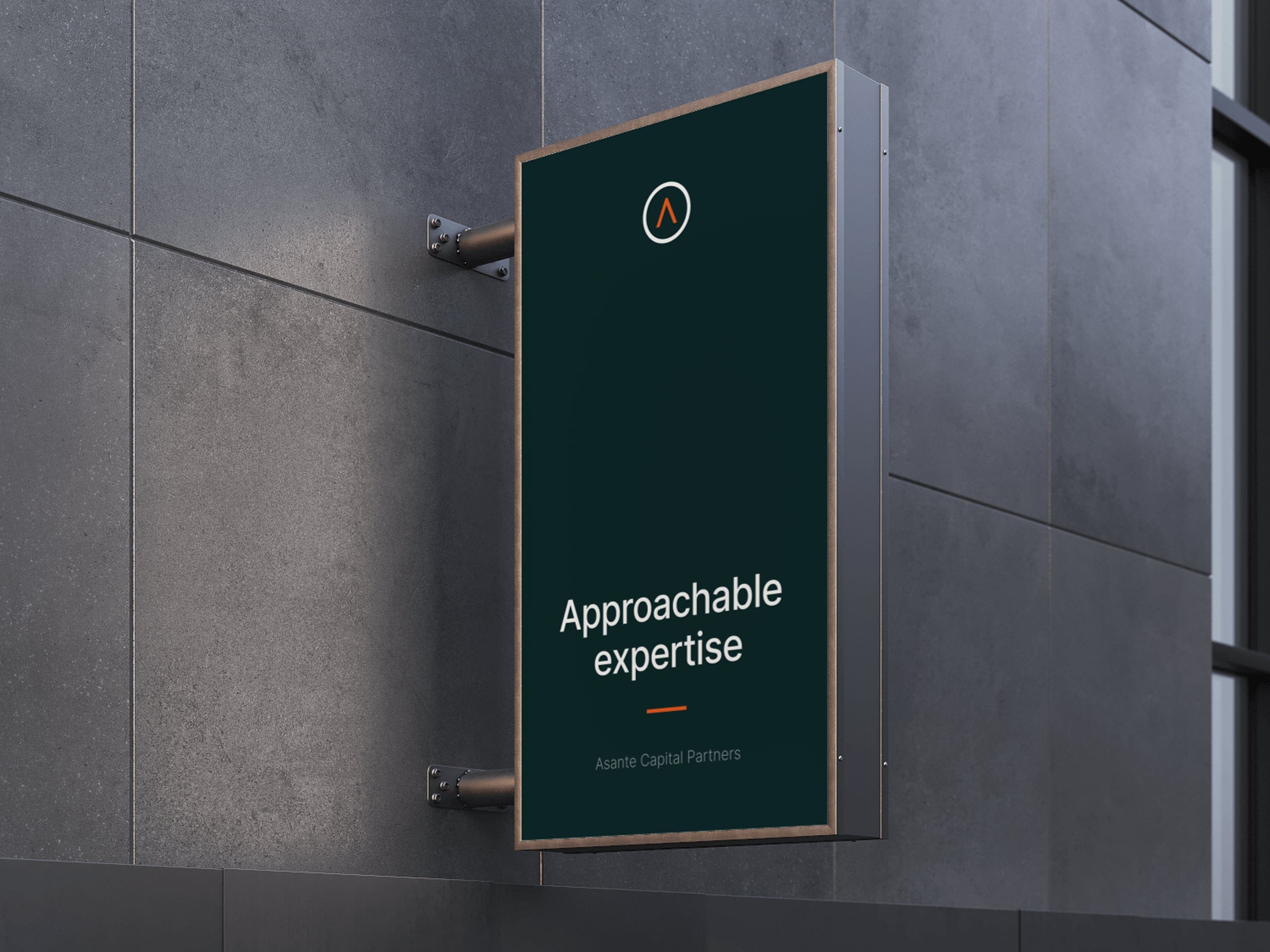
The creative process for this rebrand was rooted in a singular idea: crafting a visual language that emulated an unwavering journey to excellence. A strong need for a dynamic brand toolkit that could ebb and flow to support the marketing and content needs of the firm meant every decision had to be carefully considered and intentionally crafted. Doing less with more became a mantra of this creative process, yielding an approachable brand without any unnecessary complexity.
The creative process for this rebrand was rooted in a singular idea: crafting a visual language that emulated an unwavering journey to excellence. A strong need for a dynamic brand toolkit that could ebb and flow to support the marketing and content needs of the firm meant every decision had to be carefully considered and intentionally crafted. Doing less with more became a mantra of this creative process, yielding an approachable brand without any unnecessary complexity.
You look great today. Want to make something exciting together? Let's chit chat.
You look great today. Want to make something exciting together? Let's chit chat.
You look great today. Want to make something exciting together? Let's chit chat.
You look great today. Want to make something exciting together?
Let's chit chat.
You look great today. Want to make something exciting together? Let's chit chat.